
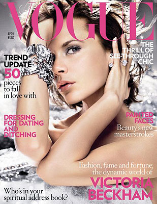
I then had to come up with a a colour scheme, I chose the colours: black, white and red. This keeps in line with the rule of three, only having three colours, more will be too much and make it look too busy and unnatractive. When I look at magazine covers such as VOGUE, GQ, LOVE, DETAILS they all have only three colours on the cover, which is why I thought that I should use only three because it will make it look much more professional than just throwing in random colours that clash.


I looked through the list of fonts that was available, I really like Calibri because it was clean and clear, which would look professional on the cover. I also decided that I was going to call my magazine 'HOMME' which translates 'MEN' in french. I thought that this would be a good name for the magazine because it would stand out like 'VOGUE'.
Good stuff Bank. Try and explain who Homme would appeal to? What sort of male student would read this?
ReplyDelete